SIMON WATKINS
  • Portraits
  • Figurative
  • Still Life
  • Store
  • About
  • Contact

Still life, still

12/29/2017

3 Comments

 
Picture
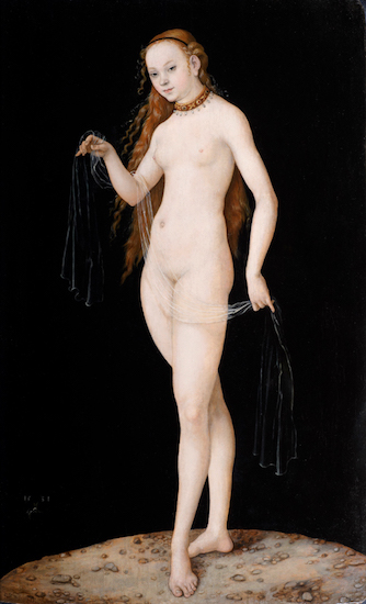
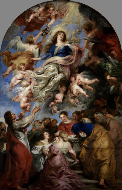
Historically, still life has occupied a pretty lowly position. It doesn’t aim to tell big complex human stories like a history painting, it doesn’t even show one human story like a portrait, nor the emotive space of a landscape. It shows a bunch of stuff essentially, the human element notable by its absence, though that is sometimes implied. It’s often part of an artist’s training, and so seen as elementary, simple, basic. All that is generally true and yet I find myself drawn to it. 


The humility of the genre is precisely why I like it. The drama of a history painting, for all its sophistication, is removed from our daily lived experience. In many ways that is the point of it. Currently I am much more interested in pictures which find meaning, beauty, and poetry in the everyday. ​
Picture
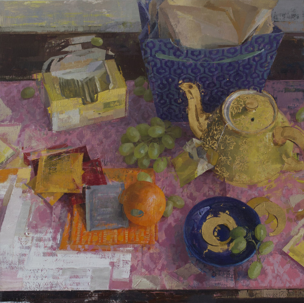
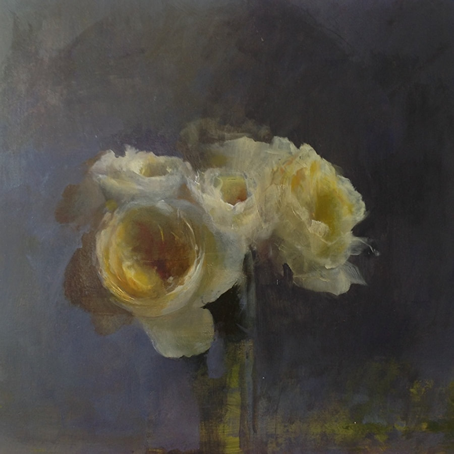
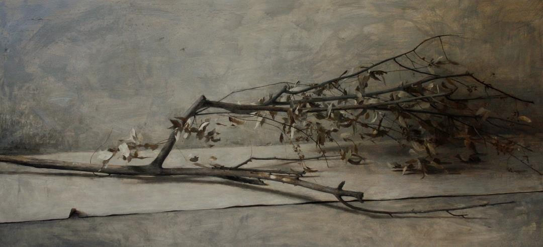
To slow down and spend time observing a few objects is a wonderful privilege: Exploring the interaction of abstract shapes and colours, becoming attuned to the subtle play of light, delighting in the peculiarities of specific forms. Still life doesn’t communicate a message or meaning, but rather holds meaning in an open-handed sort of way. They are meditations not polemics. Whether the objects themselves suggest some associated memory, or the light suggests some associated mood, the still lifes I like tend to be very open to the viewer bringing meaning to the picture. I’ve never responded well to still life which does the opposite, trying to tell the viewer the meaning, such as Baroque still lifes designed to display wealth, or symbolic images whose iconography one must decode. 


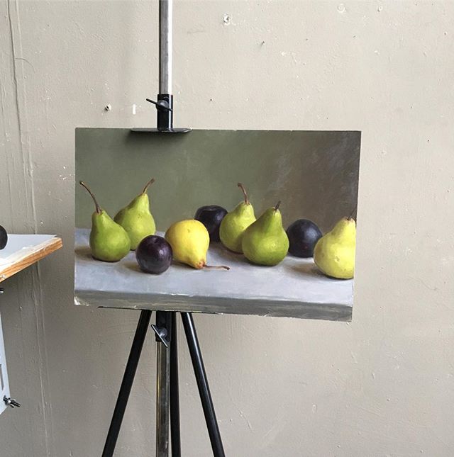
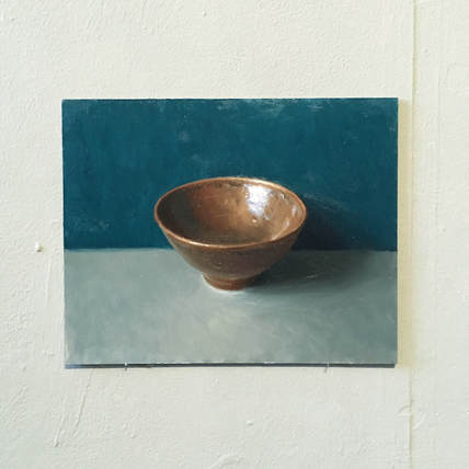
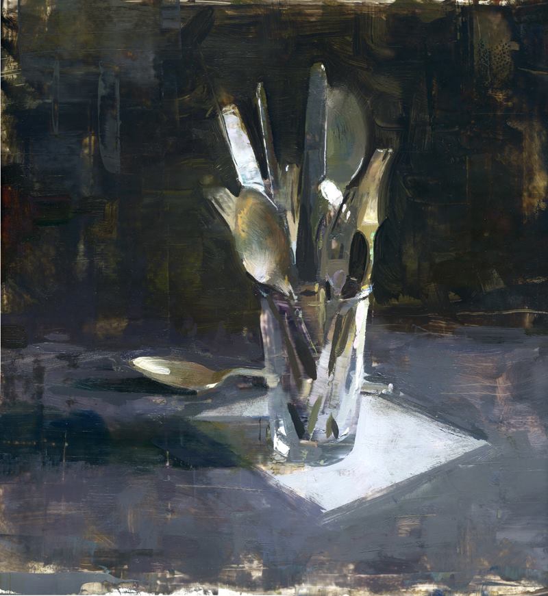
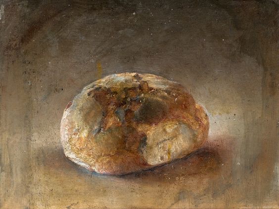
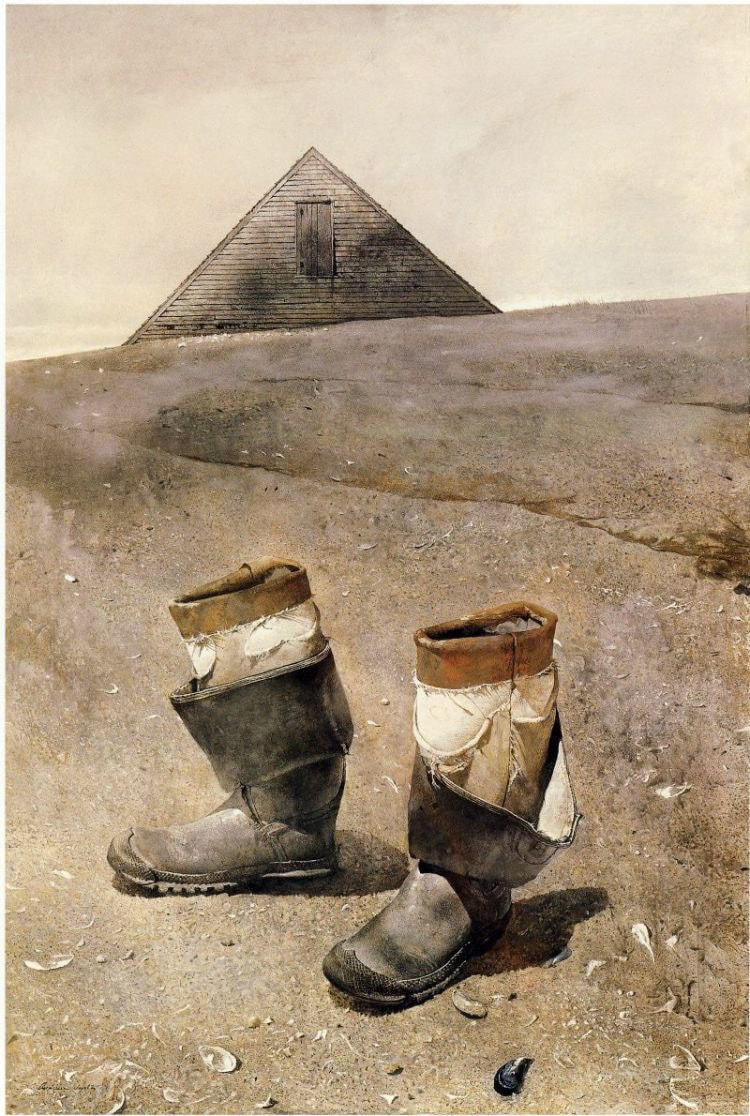
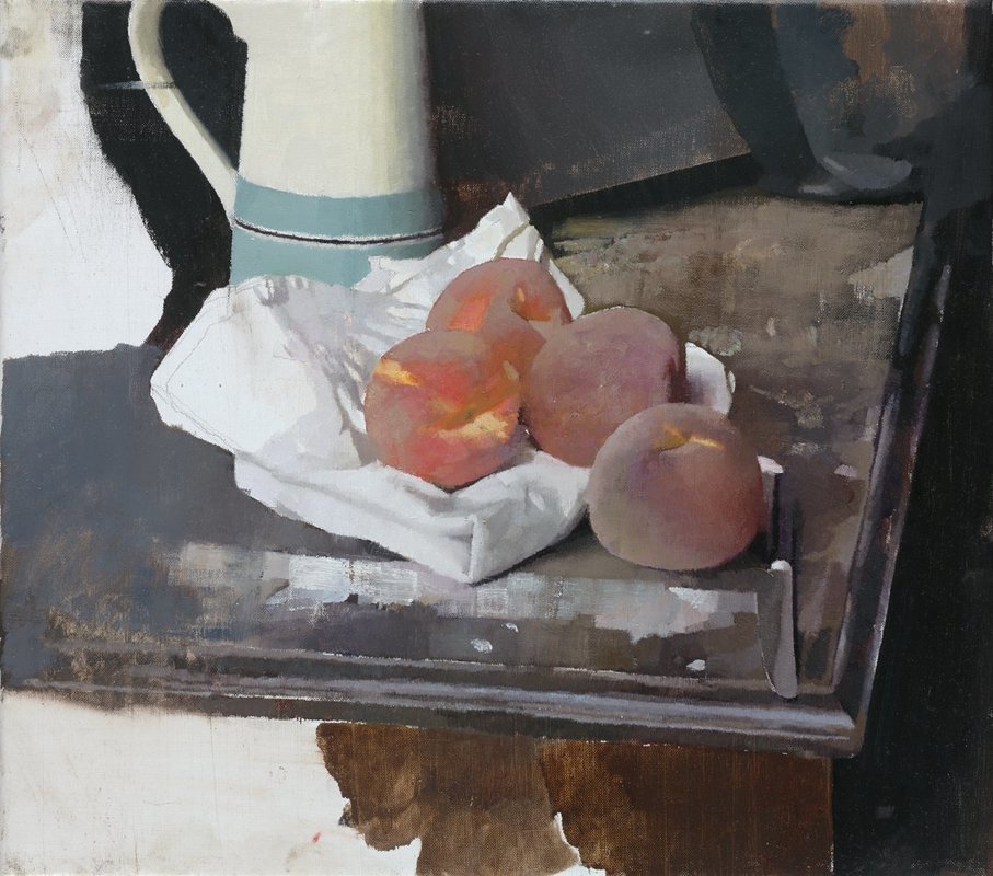
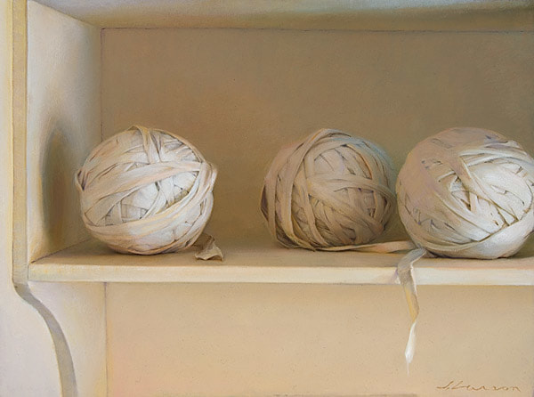
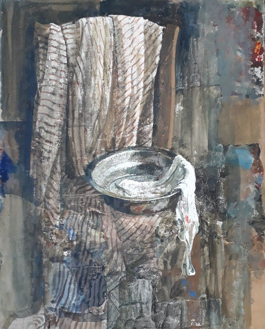
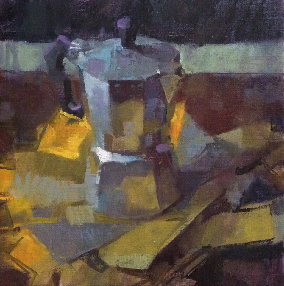
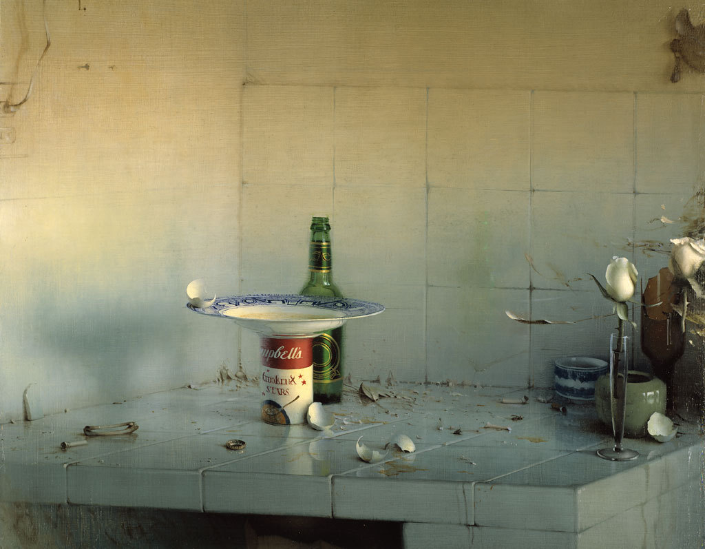
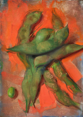
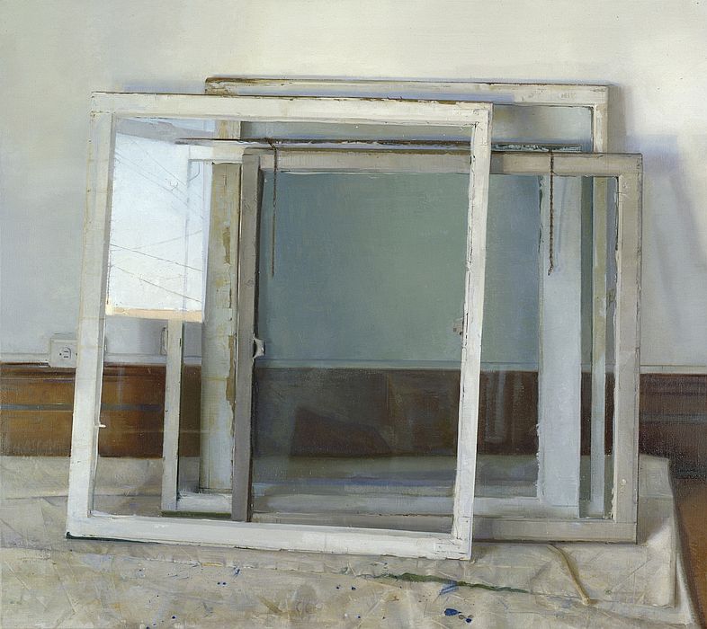
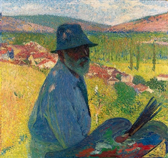
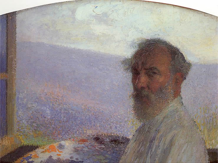
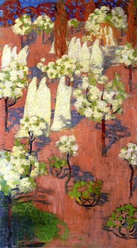
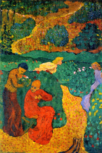
There are numerous masters of the genre to be found in great museums: Claesz, Chardin, Fantin-Latour, Cezanne etc. But I want to focus on contemporary painters in this post. Below are a handful of still lifes by contemporary painters which I love.

Picture
Jon Redmond
Picture
Odd Nerdrum
Picture
Andrew Wyeth
Picture
Diarmuid Kelley
Picture
Jeffrey T Larson
Picture
Safet Zec
Picture
James Bland
Picture
Daniel Sprick
Picture
Duane Keiser
Picture
Christopher Gallego
Picture
Zoey Frank
Picture
Kathleen Speranza
Picture
Michael Klein
3 Comments

Traditional??

3/9/2017

0 Comments

 
Like the surly lead singer of a garage band saying that they defy genres and resent being labelled, every artist probably squirms at whatever label they are given. I don’t really mind being called a realist, even if it’s not the word I’d choose; it’s mostly semantics. There’s one word I hear a lot though, which does leave me uneasy, and that’s “traditional”.


I’m not sure what’s meant by it, or whether I should resent it.  My instinct is to resist it, and say something along the lines of: “I’m every bit as contemporary as any other artist, I just paint in a manner which people associate more with bygone eras, but it’s a language with which to communicate and is relevant in any era.” But that’s a bit long winded and more often than not I shuffle and smile awkwardly and mumble, “um, yes, I suppose so”.


Really though, I think all artists are traditional, in the sense of working within a tradition.  Whether that tradition is one that flows through Titian-Van Dyck-Reynolds-Sargent or Raphael-Ingres-Degas or Kandinsky-Mondrian-Rothko or Duchamp-Beuys-Emin. If you call what you do Art, you’re working in a tradition.


So I now choose to accept it when people call me traditional, even if what I mean by that might not be what they mean.  I thoroughly love the tradition in which I work. I am quite unashamed of drawing deeply on that tradition. A tradition is alive and develops, I don’t feel constrained by it but rather energised by it.


I remember someone talking about how a composer’s oeuvre often has three phases. First they work firmly within a tradition. They work is in line with the aims and interests of others who have gone before. Then they work alongside the tradition. They don’t reject it, but their work has developed in its own way, in reference to that tradition. Finally they might work outside of that tradition. Gradually their work changes and they then have quite different aims and interests.  This third stage is actually one that very few composers ever enter, and we make a mistake if we imagine it as the champion’s stage.  Most of the greatest composers, writers and artists from the past and present day spend their lives working in or alongside a tradition.  


Of course it’s definitely possible to be boringly derivative, a pale imitation of a greater figure within the tradition. But that’s a stage in its own right. I can’t think of a single great artist who didn’t have a period (often a pretty long one) where they were not too distinct from their master or school. 


So in one sense, I’ve come to terms with the idea of my work being called “traditional”.  Call if what you like, I just hope you get something out of looking at it.
0 Comments

Fakes and Fakers

10/7/2016

0 Comments

 
We all like a good forgery story.  A good mix of skill, cunning, getting on over on “the experts”, it seems like a kind of crime committed by someone with the eye of a connoisseur but with a subversive sense of humour. It almost feels like a victimless crime; if we like the fake, we like it.

The latest story is one which I think is going to grow over the coming months. It started with a painting supposedly by Lucas Cranach, in the collection of the Prince of Liechtenstein, being seized by French authorities as part of an investigation which brought its authenticity into question.
Picture
Not Cranach
And now Sotheby’s has confirmed that tests on a supposed newly discovered Frans Hals portrait have shown it to be a fake. They reimbursed a client and will be looking to recoup that money from the Weiss Gallery who sold it.
Picture
Not Hals
And the Weiss Gallery also sold another probable fake. This picture painted on a piece of lapis lazuli, attributed to Orazio Gentileschi, was sold by them a few years ago.
Picture
Not Gentileschi
The forger remains unknown, and I for one am in awe of their brilliance. These three pictures are totally different in style and technique, and all very convincing.  They’re not copies of existing works either, they’re originals. The approach of each artist has been absorbed and new works created, some time within the last decade or so.

I would love to say, "Yes, I thought they didn't look right" but the unsettling truth is I had really admired both the “Hals” and the “Gentileschi” when I saw them.  I even spent an hour or so sketching the picture of David with the head of Goliath when it was on display temporarily in the National Gallery.  Usually I pride myself on having a good eye for what’s legitimate and what’s a copy/imitation/fake, but I admit I was completely taken in. I’m not intimately acquainted with Gentileschi’s work but Hals is someone I’ve spent hours looking at. I wasn't just fooled in to thinking it was legitimate, I thought it was a brilliant bit of painting. That hair. That bony hand. That spark of life that comes from the brilliant dashes of highlights and accents. 
Picture
Picture
Have my eyes failed me, am I a less discerning viewer than I thought? I’m not alone in being tricked however. The National Gallery proudly displayed “Gentileschi” and the Louvre tried but failed to buy the “Hals”.
​
I have to wonder whether the “Hals” in particular appeals not just because it looks like the master’s work, but maybe because in some way it appeals to our 21st century eyes. One of the most famous forger stories is that of Han Van Meegeren, who faked Vermeer to great acclaim. He had to confess (and prove his abilities in court) in order to avoid being accused of Nazi collaboration having sold one “Vermeer” to Goering. Incidentally, he actually faked a Hals too. His story is fascinating, but what I’ve always found incredible is how bad his “Vermeers” were. Really bad. It’s a wonder anyone was fooled. To me they look more emphatically like 1930’s people than 1660s. The only possible explanation is that they appealed to 1930s eyes. A kind of old master for modern tastes.  There's no avoiding the fact that each generation views the art of former times through the lens of their own cultural and aesthetic milieu
Picture
Van Meegeren in court, showing how he created the paintings hanging around the room.
Picture
Doesn't Christ look like a 1930s hollywood actress?
Is it possible that in a few decades I’ll look back at this fake Hals and think, “how on earth was I taken in?? It looks so obviously like a man of c. 2010 not 1610”? Maybe. Or maybe this forger is just someone who loves Hals like I do, and has taken that admiration for the master to impressive but criminal levels. 

Whatever the facts are, my guess is there are many more fakes to be revealed, and some will be in prestigious collections. And some won't be revealed at all but will continue to delight and deceive.

p.s. For what it's worth I don't think fakery and forgery are victimless crimes. Not just the buyer is conned, but critical understanding of artists and art history is distorted.
0 Comments

Baroque and Roll in Belgium

9/13/2016

0 Comments

 
I have been kept busy this summer painting seven members of a family at their beautiful schloss in Bavaria. Having a car loaded with kit for the trip to Germany meant it would have been a missed opportunity not to have gone exploring on the drive home.  Despite counting Anthony Van Dyck as one of my favourite painters, I had somehow never made the trip to Antwerp to see his and his master Rubens’ hometown, which is of course filled with their work.

I love seeing paintings hanging in the place for which they were intended, rather than in a gallery. Venice is, to my mind, the best place to experience this.  It turns out Belgium is brilliant for it too.  The cathedrals and churches are bursting with paintings by Rubens and his followers, the best being Van Dyck, but Jordaens and others don’t fare too badly either.  The main art gallery of Antwerp is currently closed for a refurb, so there were pictures I missed, but the altarpieces are mostly still behind altars
Picture
Elevation of the Cross, triptych
With my endlessly patient wife Anna, Antwerp cathedral was the first stop.  Here hang three colossal works by Rubens. The Elevation of the Cross (1611) and its counterpoint the Descent from the Cross (1614) are both visible from far west end of the knave. There’s much to admire in the Elevation, all the straining and stress is dynamically expressed like a big Hollywood blockbuster. But the Descent is on another level. The dynamism is there, but rather than expressing physical strain the descent is graceful, elegiac, mystical. All the different figures actions are harmonised in one almost lyrical movement.  Though they hold the dead figure of Christ, Rubens shows many of them not quite touching him, and even those supposedly baring his weight somehow seem not to fully hold him. The sense is that this pale glowing form is no ordinary dead body, a significant idea to depict behind the altar, site of the eucharist.  There are many exquisite details one can barely see even right up close, like the tear which rolls down Mary’s cheek, and yet the picture can be clearly read from the back of the Cathedral too.
Picture
Descent from the Cross, triptych
Behind the high altar hangs the Assumption of the Virgin painted some fifteen years later. It is lighter, more colourful, and extraordinary but perhaps a bit more frothy. Maybe it’s the subject matter, maybe it’s Rubens’ later sensibility, but I wasn’t much drawn to it from afar. However, as with most great painters, even in a painting I don’t much like, there are passages of real brilliance. This trio of figures at the bottom showed what a great colourist Rubens was, combined with his seemingly effortless harmonising of separate forms with swirling energetic line.
Picture
Picture
Assumption of the Virgin Mary and a detail, above
So to Ruben’s home and studio, which is fun to compare to Rembrandt’s in Amsterdam.  The studio space is naturally ideal; huge windows and lots of space (although I still feel certain he must have had other spaces around town given how prolific he and the large number of assistants in his studio were).  For me the standout picture on display was (perhaps unfairly in Rubens’ home) a recently rediscovered late Van Dyck self portrait, hung opposite Rubens’ little portrait of him.  It’s related to the famous self portrait that was recently saved for the nation, currently touring galleries around the UK.  It’s thought the upward moustache suggests this his public face as a man of the court, in contrast to the subtly more introverted man at home with his moustache down. Regardless, the subtlety in the colouring and the spark of life is wonderful. It positively breathes.
Picture
Picture
Today's a moustache up day I think.
Anna’s favourite was this little picture thought to be a posthumous portrait of Rubens’ daughter. He painted her when even younger too, and in both it’s clear she looked a lot like her mother, Isabella Brandt. Having just painted three generations of one family myself, it’s fun to notice the family traits which are characteristic. Surprisingly, the picture was sold by the Met Museum in NYC, believing it was by a follower of Rubens, and now there’s some debate among scholars about who’s right.
Picture
Picture
Picture


​Clara Serena Rubens aged 5 and 12, and her mother with those distinctive eyes and smile.
Dotted around Belgium are various Van Dyck altarpieces.  In Mechelen I found this one. Jesus has one arm looking a bit too short, but I enjoyed the inventiveness in the writhing poses of the two criminals on either side, and the paint handling was great on the figures. Interesting to see too how some areas are finely modeled, while others are little more than initial drawing.
Picture
Picture
Picture
Perhaps the only reason to go to Mechelen, but it's reason enough.
I had forgotten that in Kortrijk hangs Van Dyck’s own Elevation of the Cross, which I’ve always thought looked superb. In his second Antwerp period, when he had come back from seeing Titian in Italy, Van Dyck painted some of my favourites. They have a soft richness in the modelling, a fleshiness that is his own rather than Rubens’. This altarpiece has that in abundance. Another day I will have to make the detour.
Picture
In Ghent cathedral, we adored the Adoration of the Mystic Lamb, aka the Ghent altarpiece by Van Eyck. It’s astonishing, and well worth making a trip to Belgium just to see this. Painted 1432, it's a miracle of painting, and almost a miracle it's survived given all that's happened to it over the years (iconoclasts, fire, theft, sawn in half, more theft...) 
Picture
A few metres away it's back to the seventeenth century for this great Rubens altarpiece of St Bavo, for which there’s a more ambitious study in London's National Gallery. ​
Picture
St Bavo in Red, his wealth being distributed below
There were so many others to be found, including a good few in St Paul’s and St Charles Borrommeo’s churches in Antwerp, as well as Rubens’ tomb in the the rather hectic St Andrew’s.

In other words, Belgium is completely stuffed full of Rubens and Van Dyck masterpieces. And having had my fill of them and also of beer, waffles and chips, I am feeling as lively as their work and perhaps looking a little more rubenesque too. Super.

If you fancy making your own pilgrimage, this site is useful for finding where everything hangs.

0 Comments

Painting the Modern Garden

4/7/2016

2 Comments

 
Not being immune to the slow but inevitable process of turning into one’s parents, I have recently become interested in gardening.  Years of blissful indifference, and now I’m reading more books about gardens than art. So the RA’s show ‘Painting the Modern Garden: Monet to Matisse’ potentially held double the usual interest to me.  But I was skeptical about the show; nothing pulls the crowds like an impressionism exhibition, and combine it with gardens and you’ve drawn in a whole secondary audience. You can hear the coffers being filled. So the fact that I enjoyed the show so much softened the cynic in me. 

Monet looms large throughout the exhibition. First and last are his paintings, and his whole approach to being a gardener-painter is a model all others seem to follow.  The exhibition starts with a coup by the curators, hanging Renoir’s picture of Monet painting his garden next to the very painting Monet must have been working on.  Monet’s is the superior, the end of day light in which the dashes of bright blooms still shine, it evokes everything that is charming about cottage gardens in the summer.  How can I paint such evocative pictures, I thought, and how can I make the mud patch behind my house that nice?  The Renoir is one of (very) few pictures of his which I actually like (I’m more of the “Renoir sucks at painting” persuasion), but given how similar the colours are I can’t help thinking he kept having a look at Monet’s canvas in progress.  Anyway, these early-ish Monets are completely charming, not at all showy, simple in their honest observation of the true colours seen outdoors.
Picture
Monet
Picture
As seen by Renoir
Pissarro, one time resident of my corner of South East London, is perhaps the only painter in the show with an interest in depicting the work of gardening, and generally in the unromantic kitchen garden. With a surprisingly limited tonal range his pictures glowed. As someone used to studio painting, where you use darks to make the lights shine, I’m intrigued at how he does this. In fact some pictures, like one of Caillebotte’s fail specifically because they push the tonal range too far.  Something to figure out still. The humble beauty of the Pissarros appealed to me, not least as I’m currently making tentative steps with an idea of painting some local allotments, which happen to be a short potter from an area he painted.
Picture
Pissarro
One of the things that struck me in the rooms that followed is quite how varied in mood and even meaning the good paintings were. I had sort of expected them all to have the same happy serenity of those first Monets. you know the feeling, that “ah isn’t it nice to be among all the pretty flowers” feeling. It’s not deep and profound, and it’s sort of fine with that because the flowers are very pretty.  The bad paintings (and to be honest, there are plenty in the show) such as the kitchy Alfred Parsons and James Tissot, the disappointingly photographic P.S. Kroyer all had that same mood in a very shallow way. But the better ones were diverse in mood and meaning.  

Take Sorolla for instance. A total master of colour. The ferocious energy in his enormous portrait of Louis Comfort Tiffany gives more a sense of the focused work of the painter (one can’t help but think the subject is really a stand in for Sorolla himself) perceiving the subtleties of colour in full saturation. It’s exuberant and showy in the best possible sense. His pictures of his courtyard garden tie him to his land and culture. The moorish influence is felt in his garden design, and the garden acts as a cool retreat in the hot sun. The order and structure of the garden design is softened by the plants that grow in it and the dappled shadows that move across.
Picture
Sorolla's huge portrait 150 x 225 cm
Picture
Sorolla's garden, well worth a visit if you're in Madrid
A complete contrast is made with Santiago Rusiñol. Not a household name, he’s not not the level of Sorolla and Monet, but I liked his sombre pictures. Sad about the neglect of many palace gardens, he paints them as requiems for a Spain that’s lost or losing its global eminence.  Deep shadows from high hedges and formal planting, the gardens are uninhabited. Usually autumnal, the light is always at the end of the day, but not in the restful way Monet paints, but rather in a foreboding way. 
Picture
Picture
Henri Martin’s pointillist impressionism is by no means groundbreaking, but it’s effective. His earlier imaginative Giotto-inspired work gave way to more straightforward landscape painting when he escaped the city of Paris and moved to a remote village in the Lot valley and spent the rest of his life mostly painting that village, his garden, and occasionally a village down the road. Within that small area he captured different light effects and moods. But the overarching feeling is one of rejuvenation in nature. The anxiety of the city gives way to the simple pleasure of watching the seasons change with all their different colour palettes. Escapism? Certainly. I’d say that’s one of the chief pleasures of a garden.
Picture
Picture
A couple of Martin self portraits (not in the show). A master of many moods.
.The garden is a space onto which the inner life is projected, whether that is melancholy or celebratory. For Les Nabis post-impressionists, the fact that trees and plants are (or seem) unchanging over the centuries means they transpose imagined narratives into the garden. In Maurice Denis and Edouard Vuillard’s images of women in the garden, they abandon a realist approach and so allow the primitivism to evoke both earlier art and earlier times. They feel like a sort of mythic biblical garden, be it Eden, the garden in Song of Songs or paradise itself. Imagination is stronger than observation. They have a charm, which depending on my mood I quite like. but then the exhibition returns to Monet and I remember why my first love is painting which responds to observation.
Picture
Maurice Denis
Picture
Edouard Vuillard
Giverny, Monet’s garden and muse is the subject of the rest of the exhibition.  Two things struck me in these last two three rooms. Firstly, the way Monet continued to push himself for his whole life. Celebrated and successful, he could have spent his days painting happy pictures of sunny landscapes to go above peoples sofas (nothing particularly wrong with that I might add). But he developed new approaches all the time. His water lily pictures are a fascinating middle point between realism and abstraction. I don’t see them as a transition point between the two as some art historians like to, but they are simultaneously both. The mood, and colour, feels completely observed. It rings true in a way only observation based painting does.  And yet, by removing the horizon something interesting happens. You become more aware of the painting as a surface. Monet’s technique always allowed the paint surface to play a big part, but here it goes to a new level. Rather than the traditional effect of a landscape, which is to create depth and space, it is resolutely flattened. He is painting a flat surface (water) on a flat surface (canvas). yet there is depth on this flat surface, as what we see is largely the reflection of what is cropped out of the composition. There are little hints at reeds etc below the surface of the water, and suggestions of what might be being reflected above, but the only concrete forms are those lilies which sit flat on the surface. They’re sophisticated without ever becoming ‘about’ this play between flatness and depth. Their primary effect is that of beautiful light and colour, and the moods they create.  Is that abstraction or is that reality, or both?
Picture
Picture
Picture
One other way he casually threw in a whole new approach to landscape painting, was painting corners of his garden life sized. It only just occurred to me looking at his 2m square canvas of a daylily, he’s painting his garden on the scale of life. By reducing the depth depicted, there’s no perspective, so everything is fully seen to scale. With his giant water lily pictures they become immersive. It’s imax in paint.  While the battles of the Great War raged around France, Monet resolutely battled on with painting in new and ever more ambitious ways. Seeing it as his patriotic duty to do so, he intended for his huge waterlily canvases to be put on public display, owned by the nation (get thee to L’Orangerie in Paris to see the best of them).  The catalogue writes of Monet’s “deeply felt need to find beauty to counter ugliness, joy to overcome sorrow, life to defeat death”, his paintings of the garden “leave a collective testament to the subject’s enduring power to inspire spiritual rejuvenation”.  Seeing the exhibition in Spring, just after Easter, I believe it.
Picture
A l'Orangerie
2 Comments

A question of technique

12/16/2015

1 Comment

 
There’s a widely held idea about technique that I think is a misconception, which is that technique is a method one adopts to create an effect.  Training in Florence, people imagine I must have been taught a bunch of techniques.  I’m not sure what's imagined these techniques might be, but there’s often the implication that there are certain tricks to create a sense of light, a likeness, believable form or colour or any other element of painting.  The longer I’ve been painting the more I’m convinced that “technique” is actually a bit of a distraction.


Arguably, this is all semantics.  Certainly, each painter has a way of using their materials, which one can analyse and describe as their technique. The material qualities of a painting play an enormous part in what makes for a great painting.  And it is true that when I see a painting I admire, I go up close and stick my nose up to it to analyse the use of paint.  There are some painters, like Van Dyck or Thomas Lawrence, who reward this kind of looking. They have such ease in drawing with oil paint, that the fluid marks show an apparently simple translation from what they see to what they paint.  There is something almost miraculous about it, and I often find myself wondering about their methods, and whether there is some technique I can learn from it. The surface quality is seductive.


Critics have always been as much in awe as wary of artists with great technical fluency.  The seductive can be meretricious. John Singer Sargent was endlessly called “clever” by critics, sometimes positively and sometimes negatively.  One critic in 1882 described his Venetian paintings as “extremely clever, and we use the word extremely as indicating at once a danger and a merit”.  Any painter with technical facility is at risk of tipping over the edge into gratuitously flashy paint use.  Even great portrait painters like Lawrence, Sargent, Boldini and De Laszlo could at times guilty of slightly showy technique at the expense of truthful sensitivity.  


There are two big problems with admiring artists for their technique.  First is the abundance of truly great paintings which don’t seem to exhibit this apparent technical brilliance.  No individual brush stroke shows any particular excellence, but the painting as a whole is utterly extraordinary.  I would argue this is true of Titian and Velazquez, two of the greatest painters of all time.  Their work is sober, almost austere, in lacking any particularly seductive surface quality.  And yet they have such force, such life that few have ever come close to them.


The second problem with the idea of technique is sort of the inverse of the first: the abundance of truly horrible paintings with apparently flawless technique.  The nineteenth century saw such an explosion in the number of artists pushing the technique of their realism, and any time I pop in to Sotheby’s or Christies to see what’s coming up (they’re often a great place to see work that is otherwise hard to see in public collections), I’m faced with an endless parade of glossy paintings, often of cutesy doll-like children or kittens playing with bubbles, which are so horrible they make me queasy.  They are probably more in control of their medium than almost any painter alive today, but few would really mind if their work was binned. The fluent technique can’t save them.


What makes both a Velazquez and a Van Dyck so great, when their technique is so different, is their sense of judgement.  Drawing, colour, composition, mark making are all a question of judgement.  There is no trick.  They both saw with extraordinary sensitivity, and painted with extraordinary judgement, using materials however would best express that vision.


Perhaps the best argument against obsessing over technique is the terrible condition of many Reynolds pictures. His endless searching after some technical ‘secret of the old masters’ (a phrase that always makes me wince), meant mixing all sorts of gunk into paint and using very impermanent pigments, resulting in endless blistered and cracked paintings the colour of black treacle. 


I’m sympathetic to ol' Reynolds though, I look at great masters and wonder what materials and methods they were using; I continually experiment with different paints, brushes, surfaces, grinding pigments and mixing mediums, and I definitely want to make my surface quality as brilliant as I can, and when I look back over the last five years, I’m glad to see it has continually improved.  But ultimately I’m trying to improve my sensitivity to what I see and my judgement in how I draw and paint it.  The technique follows from there.
1 Comment

The work of art in the form of mechanical reproduction *

11/15/2015

1 Comment

 
* With apologies to Walter Benjamin

Very often I find that an artist whose appeal I had never really understood only makes an impact on me when I see their work "in the flesh", and then I am blown away. The reverse can happen too, seeing some artwork first in photos, only to be disappointed seeing it for real. Whether it’s the Mona Lisa (smaller than you expected?), or something contemporary (flatter than you expected?), it’s always surprising how different the original can be.  


The ways in which technology is changing the way we appreciate art are almost limitless.  One thing I’ve been pondering recently is the rise in quality photographs of paintings.  Not so long ago it was hard to find a decent photograph of most paintings.  Many art books had frustratingly small reproductions of low quality, and those from before 1990 are generally useful for the text only.  Many of the classic texts of art history, such as Anthony Blunt’s Artistic Theory in Italy 1450-1660, have no more than a dozen black and white pictures, if any at all.  


For most of history before this, reproductions meant engravings, and artists in different countries learnt of the great works of other places and times through these.  Inevitably, an engraving is a interpretation of the painting into a different medium.  Composition can be seen (often in reverse), but the tonal qualities could vary dramatically, either due to insufficient skill from the engraver or to the limitations of the medium itself.  

Picture
Picture
Imagine only knowing Raphael's Gallatea from Marcantonio Raimondi's terrible engraving
Over time new technologies changed this by varying degrees, and the skill of many engravers was breathtaking.  Mezzotints in particular could capture much more of the atmosphere than previous images, but still colour and texture could only be imagined.  Along comes photography and slowly images get better and better.  Art books now have become extraordinarily high quality.  I recently was give the new mega-book on Velazquez from Taschen, in which many details of the paintings are reproduced to the scale of the original in perfect focus.  And online, many galleries show super high resolution images of their collection, and I learn about contemporary artists primarily through seeing photos of their work online.  I’m a huge fan of all of this.  I have more art books than shelf space, and my laptop is full of high quality photos from which I get inspiration and instruction.   This is undoubtedly a Good Thing.  We can see work on the other side of the world which we very well may not ever see in person, and we can see details of work that is hung too high to see clearly.

Picture
Picture
 This mezzotint does a great job of showing the light effect in the Van Dyck, though naturally misses the warmth of colour.

It is definitely a mixed blessing though.  There is a danger when the reproductions seem so high quality to forget that the photo is not the work itself.  It doesn’t matter how high resolution a photo is, it is not a painting. It can’t capture the experience of standing in front of the painting, and I’m not talking about some mystical aura that surrounds the painting (c.f. Walter Benjamin's Work of Art in the Age of Mechanical Reproduction).  I keep buying Rembrandt books in the hope that one of them will do a better job of this, but I have to give in and accept that a painting by Rembrandt simply doesn’t reproduce well.  In fact, it strikes me that there is almost a direct relationship: the better the painting, the greater the gap there is between the original and the photo.  If forced to list my favourite artists of all time (not that I could), I would find that many of them I rarely look at in reproduction.: Rembrandt, Turner, Titian, Monet…none of these have a fraction of their power in reproduction.
Picture
​Zoom in all you like, it's nothing like looking at the original. You'll never feel Rembrandt is looking back at you.

It’s partly a matter of scale; a photo could be 1% of the size of the original, even in a heavy coffee table book.  It’s partly a matter of material.  A painting is painted on a flat surface, but it’s not a flat object.  Layering of opaque and translucent paint, with mixtures of oils, resins and varnishes, create images which breathe, shimmer and glow.  Rembrandt once wrote to his client, Huygens, that his painting should be hung “in a strong light and where one can stand at a distance, so it will sparkle at its best”.  That sparkle, simply doesn’t happen in a book.  Back the the bad old days of dodgy engraved reproductions, one was very aware that the engraving was a mere echo, a shadow of the original.  Now with all our wonderful technology, there is a risk we replace the original with the reproduction.  And with that, we risk losing an understanding and appreciation for the very thing that makes for a great painting.  


This is very much a reminder to myself not to get too absorbed in books and shiny new online resources, but to get on my bike and head to the galleries. It’s also a plea for everyone to go and see the amazing work on display for free all over the country.
1 Comment

A beginning

11/15/2015

1 Comment

 
With any luck I will post here various bits and pieces with enough regularity that I won't have to start each post with an apology for radio silence.  I plan to write about things I'm working on, exhibitions I've seen, galleries visited, artists admired, thoughts chewed on, and pretty well anything else that is directly or indirectly related to my work. Some posts will be mostly pictures, some mostly words. Few will contain cats, there's enough of those elsewhere.
1 Comment

    Studio notes

    Ponderings and wanderings

    Archives

    December 2017
    March 2017
    October 2016
    September 2016
    April 2016
    December 2015
    November 2015

    Categories

    All
    Art History
    Technique

    RSS Feed